Apart from being snug, a bedroom feels right when the colours and patterns work in harmony. It’s a place of rest, so elements in this area must not compete against each other.
There’s no need for them to match perfectly, either. Still, they should get along. If they don’t conform, the room feels busy for all the wrong reasons.
Start with a Base That Holds the Room
Every space needs a base colour to pull things together. It might be a soft grey or a deeper tone like navy. Pick one and let it run through the main pieces, like walls, bedding, or curtains. Doing this gives everything a common thread.
That anchor stops the room from looking like it came together in a rush.
Be Picky with Patterns
Patterns give a room life, but too many can drown it. One strong pattern is plenty. The rest should play backup. Smaller prints or textures that nod to the main design without stealing the show must be present.
For example, some quilt covers have a big floral print that don’t gel well with some tastes. You can make it work by using cushions that pick up one of the quilt’s colors but stay in a plain weave. That’s how you keep the eye pleased without exhausting it.
Let Texture Do Some of the Work
Not every surface needs a pattern. Texture can add depth without introducing more shapes or colours. Think chunky knit throws or a velvet cushion in a block colour.
These shifts in texture break up flat areas. They also keep the look from feeling too one-note.
Practical Ways to Blend It All
There’s no single formula. These small habits make mixing colours and patterns a lot easier:
- Keep the main palette small. Stick to two or three core shades.
- Repeat colours in more than one place.
- Let one pattern lead and keep the rest understated
- Break up bold prints with solids that calm the mix
- Use texture when you don’t want to add more pattern
Following even two or three of these will keep the design steady.
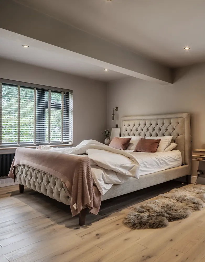
Start with the Bed
The bed is the anchor in most rooms. It’s the first thing you see when you walk in. Thus, interior designers start from it. Choose bedding that suits your tastes.
After sorting the bed, build the rest of the room. Choose accessories that won’t steal the spotlight.
Play with Light and Dark
A room with only light colours can feel flat. A room with only dark colours can feel heavy. Mixing the two keeps things balanced. A light quilt with a darker throw works. So does a dark bed frame with pale sheets.
That contrast gives the eye somewhere to rest.
Think Comfort as Much as Style
Even if you have the best-looking bedroom, you’ll still be unhappy if it doesn’t serve its purpose. Beautiful interior must be fused with comfort.
Choose fabrics that work well in the climate. In summer, light cotton keeps things fresh. In winter, heavier weaves add warmth.
Even practical pieces can fit the look. Good-quality single bed sheets in a neutral tone can sit under patterned layers and still play a role in the overall design.
Tie It Together with Small Touches
Decide on the smaller accents after putting the big items in place. Although these details are tiny, they uplift the palette through the rest of the space. That said, it’s still important to choose the right trinkets and supporting elements.
For example, you can choose a throw pillow in the same colour as the curtains. Lampshades also fall under this step. Choose one that picks up the tone of the rug.
Step Back and Edit
Not every idea works immediately. Sometimes, taking a piece out makes everything else fall into place. If the space feels too busy, remove the loudest element and see what happens.
A cohesive room isn’t perfect. It’s balanced. Every piece has its place, and nothing feels like it’s shouting over the rest.
- About the Author
- Latest Posts
Our Editorial Team are writers and experts in their field. Their views and opinions may not always be the views of Wellbeing Magazine. If you are under the direction of medical supervision please speak to your doctor or therapist before following the advice and recommendations in these articles.