Why Colors Matter in a Student’s Room
Your room is more than just a place to sleep—it’s where you study, relax, and recharge. The colors in your space can affect your mood, focus, and energy levels without you even realizing it. A well-thought-out color scheme can make studying easier, help with relaxation, and even improve your overall well-being.
Choosing the right colors isn’t just about style—it’s about function. Some shades make a space feel bigger, while others create a cozy, intimate environment. Certain colors stimulate creativity, while others promote calmness. That’s why understanding interior design color psychology can be a game-changer when designing your student space.
For students balancing coursework and life, a well-designed space can help improve focus and motivation. And if schoolwork ever becomes overwhelming, just like how some students look for ways to pay for research papers https://paperwriter.com/pay-for-research-paper, you can find ways to make your space work better for you by using the right colors strategically.
How Color Affects Mood and Productivity
Energizing Colors for Studying
When you need a boost in concentration and energy, certain colors can stimulate the brain and keep you engaged. Shades like yellow, orange, and bright green are known for enhancing focus and creativity. If you’re looking for what room colors affect your mood, these are great choices for a study nook or desk area.
These colors are particularly effective in smaller doses—like on a single wall, in furniture, or through accessories. Too much brightness can become overwhelming, so balance bold colors with neutral tones to avoid overstimulation.
Calming Tones for Relaxation
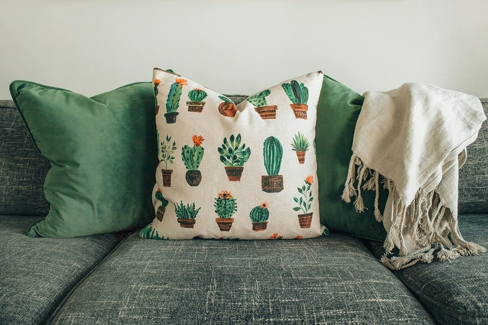
Not every part of your room should be about productivity—you also need areas for rest and relaxation. Cool shades like blue, lavender, and soft green create a peaceful atmosphere. These are ideal for sleeping areas since they can lower stress levels and help with unwinding after a long day.
Using these tones in bedding, curtains, or accent walls can help signal to your brain that it’s time to relax. If you struggle with stress or anxiety, having these calming shades in your space can make a noticeable difference in how you feel.
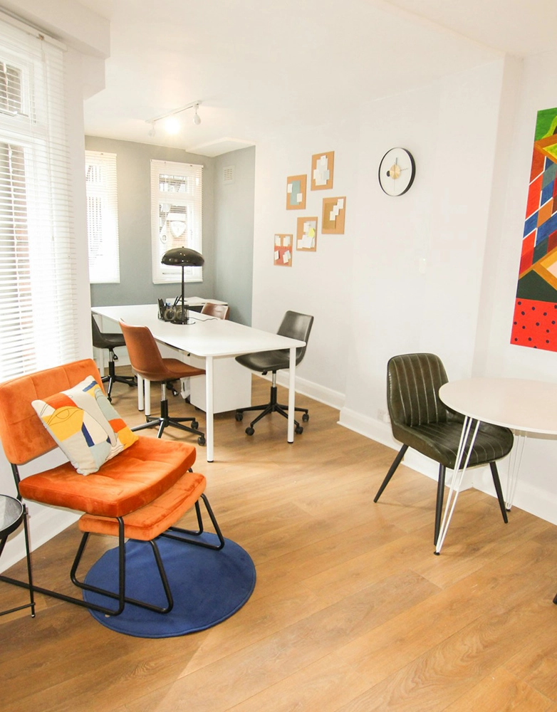
Balanced Neutrals for a Versatile Space
If you don’t want bright colors dominating your space, neutrals like beige, gray, and soft pastels can provide balance. They work well in shared rooms or dorm spaces where multiple people need to feel comfortable. When thinking about the psychology of colors in interior design, neutrals allow for flexibility while still keeping the space inviting.
Neutrals also work great as a base color. If you’re unsure about committing to a bold color, start with a neutral background and add color through decor pieces that can be changed easily, like rugs, pillows, or wall art.
Psychology of Colors in Interior Design: How to Use Colors in Your Room
Study Zones Need Productivity-Boosting Colors
For students who struggle with staying focused, using bold accent colors can help. A yellow desk lamp, green study chair, or orange bookshelf can add a touch of motivation without overwhelming the room. The key is to keep it balanced—too much of an intense color can become distracting.
Consider creating a designated “focus zone” within your room by painting a single wall a stimulating color or adding colorful sticky notes and posters. This can create an environment that encourages deep concentration when it’s time to study.
Resting Areas Should Promote Calm
When deciding does the color of a room affect human behavior, look at how color is used in relaxing spaces like spas or meditation rooms. Soft blues and gentle purples are commonly found in these areas because they help reduce anxiety and promote deep relaxation.
Adding soft-textured fabrics like plush blankets, fluffy pillows, or smooth curtains in these colors can reinforce the sense of calm. The more your surroundings signal rest, the easier it will be to unwind after a stressful day.
Social Spaces Should Feel Warm and Welcoming
If your room doubles as a hangout spot, warm and inviting colors work best. Soft oranges, muted reds, and earthy browns make a space feel more social and encourage conversation. When considering color psychology for rooms, warm tones are perfect for living areas or common spaces.
Placing warm-colored furniture, tapestries, or accent walls in communal areas can create an atmosphere that encourages engagement and interaction. Even a simple warm-colored throw blanket on a couch can make a shared space feel more inviting.
Interior Design Psychology: Small Changes with Big Impact
Use Accessories to Test Colors
If you’re unsure about painting walls, you can still use color psychology through accessories. Throw pillows, rugs, wall art, and curtains are easy ways to experiment with different shades without making permanent changes.
Rotating seasonal decor is another way to refresh your space without a major commitment. Cool blues and greens in the summer can make your space feel fresh, while warmer hues in the winter can create a cozy atmosphere.
Lighting Affects How Colors Appear
Natural light makes colors look brighter, while artificial light can change how a color feels. A warm-toned lightbulb will make yellows and oranges feel cozier, while cool-toned bulbs can make blues and greens feel more refreshing. This is a key part of interior design psychology that many people overlook.
If your room lacks natural light, opt for LED bulbs that mimic daylight. This keeps colors looking vibrant and reduces the dull, washed-out effect that some artificial lights create.
Mix and Match to Create Balance
Too much of one color can be overwhelming. The best approach is to combine energizing and calming colors to create the right balance for your personal space.
For example, if your walls are neutral, you can add bold-colored furniture or small decorative pieces to bring in energy without overloading the room.
Using a mix of textures can also enhance the way colors interact in a space. A matte blue wall with a glossy white desk or a soft green chair against a wooden floor can make colors pop without overpowering each other.
Final Thoughts
The colors in your room do more than just look good—they affect how you feel, focus, and function. Whether you’re looking at interior design for studying, sleeping, or socializing, the right colors can make a difference.
By understanding the psychology of color in interior design, you can design a space that helps you feel your best every day. And if you’re ever feeling stuck, small changes like adjusting your lighting or adding colorful accessories can help transform your space without a major commitment.