


Understanding Color’s Role in Human Emotions
-
- October 10, 2025
Color plays an integral role in shaping how people feel, behave, and perceive their surroundings. From the soft pastels that calm the senses to bold tones that stir excitement, color influences human emotions in subtle yet powerful ways. This connection between hue and feeling has been recognized across cultures for centuries, used in art, fashion, architecture, and marketing to communicate messages that words cannot.
Colors can alter a person’s energy, shift focus, and even change perceptions of temperature and space. Every shade carries meaning, and these meanings often affect mood and decision-making. Understanding how the human mind interprets color opens a fascinating window into emotion, psychology, and culture.
The Psychology Behind Colors
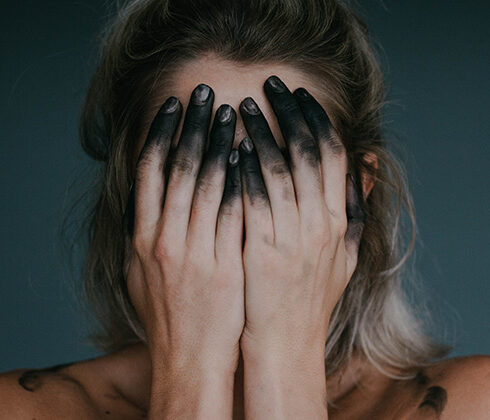
The study of how color influences human behavior began long before psychology became a formal science. Ancient Egyptians and Chinese philosophers connected colors with healing and balance, using them to restore harmony in the body and spirit. Today, psychologists recognize that colors can produce measurable physiological responses, such as changes in heart rate, energy levels, and appetite. Warm hues like red, orange, and yellow often evoke passion, energy, and warmth, while cooler shades such as blue, green, and purple tend to bring calm and relaxation.
Each person’s reaction to color is also shaped by personal experience and cultural meaning. A shade that evokes happiness in one person may bring sadness to another. This is because the mind does not experience color in isolation; it associates hues with memories and emotions stored deep within. Marketers and interior designers use this understanding to influence how people feel in certain spaces or react to products. A bright red advertisement may draw immediate attention, while a soft blue package can suggest trust or reliability. The interplay between psychology and color continues to fascinate researchers and artists alike.
Colors in Everyday Spaces
Rooms and environments have a profound effect on emotional balance, concentration, and comfort. When selecting paint or décor, people often think about aesthetic appeal without realizing that the shades they choose influence mood and productivity. Imagine a living room filled with warm golden tones that invite conversation and laughter, or a bedroom cloaked in pale blues that soothe the senses. It is within this context that designers often study how color affects mood in domestic settings, exploring how walls and furnishings shape emotional response. Soft greens and muted blues tend to make rooms feel restful and refreshing, ideal for spaces dedicated to unwinding after long days. Earthy neutrals create a grounded atmosphere that supports reflection, while bold reds or oranges add energy and can stimulate appetite, making them common in dining areas. Pale yellows bring light and optimism into kitchens and studies.
Even subtle variations in hue can shift a room’s emotional tone. Lighting plays its part too – natural sunlight enhances warm colors, whereas artificial light can alter their intensity. Understanding these relationships helps people create environments that match their emotional needs.
Cultural Meanings and Associations
Color meanings vary dramatically across cultures, reflecting values, traditions, and history. In Western societies, white often symbolizes purity or peace, yet in some Eastern cultures it represents mourning or loss. Red can signify passion and love in one region but stand for prosperity and celebration in another. Blue, often linked to calmness and loyalty, is considered sacred in several traditions, associated with protection or divine power.
Such diversity in interpretation shows how human emotion and culture intertwine. Designers and marketers must remain sensitive to these variations when working in global contexts. A logo that feels inviting in one country might carry an unintended message in another. Similarly, ceremonial dress, national flags, and religious symbols rely heavily on color to express shared identity and values. This universal yet deeply personal connection explains why color continues to communicate in ways words cannot.
The Science of Light and Perception
Color is not simply a property of objects but a perception created by light. When light strikes a surface, certain wavelengths are absorbed and others reflected; the human eye detects these wavelengths and interprets them as color. This process occurs in the retina, where specialized cells known as cones respond to different wavelengths corresponding to red, green, and blue. The brain then combines these signals, forming a complete image with depth and emotional resonance.
Research in neuroscience suggests that the brain’s response to color is both instinctive and emotional. For instance, red light can increase adrenaline levels and alertness, while blue light tends to lower blood pressure and promote calm. This physiological link explains why certain colors can energize or relax people without conscious thought. Light intensity and hue interact with circadian rhythms, influencing sleep, alertness, and even appetite. As scientists continue exploring this connection, color’s role in human well-being becomes increasingly clear.
Color in Art and Expression
Artists throughout history have used color to convey mood, tell stories, and evoke emotion. From the deep reds of Renaissance paintings to the vivid abstractions of modern art, each period reveals new insights into how color communicates feeling. Painters often describe color as language – a way to express what words cannot capture. Writers, filmmakers, and designers borrow from this idea, crafting experiences that guide emotional response through visual tone.
Color theory, developed by figures like Goethe and Kandinsky, links emotion directly to hue and contrast. A single shift in color can change the meaning of an image entirely. A cool palette may suggest solitude or reflection, while a warm palette brings intensity and movement. In fashion and design, these choices shape identity and mood, allowing individuals to express personality or intention through appearance. Color has the power to unite creativity with psychology, bridging the gap between perception and expression.
Using Color for Emotional Balance
Understanding how different shades affect emotion can help people design balanced, supportive environments. For individuals seeking calm and focus, muted tones such as sage green, soft gray, or light lavender work well. These hues promote relaxation without dullness, creating spaces conducive to mindfulness or rest. People who crave energy might prefer accents of red, coral, or sunshine yellow; colors that inspire enthusiasm and liveliness.
In workspaces, color choices influence motivation and concentration. Blue encourages clear thinking, while touches of green reduce fatigue by evoking nature’s calm. Warm tones can increase collaboration in group settings, helping conversation flow more easily. Public spaces like hospitals and schools often use carefully selected palettes to create comfort and reassurance. When applied thoughtfully, color becomes more than decoration; it becomes an instrument for emotional well-being.
Color shapes human emotion in subtle and profound ways. It reaches beyond language, influencing perception, memory, and mood. Whether through cultural meaning, psychological association, or physiological response, every hue carries a message. The shades that fill rooms, paintings, and clothing choices communicate without words, shaping how people think and feel in daily life. Understanding this connection allows for more thoughtful design, deeper artistic expression, and greater emotional balance.
Image
- About the Author
- Latest Posts
Our Editorial Team are writers and experts in their field. Their views and opinions may not always be the views of Wellbeing Magazine. If you are under the direction of medical supervision please speak to your doctor or therapist before following the advice and recommendations in these articles.